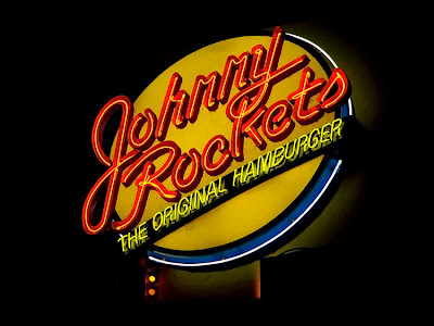
Ok, before anyone jumps all over me for today's title, Johnny Rockets does NOT have an apostrophe! I even Googled it to make sure that the logo/sign here didn't have one on purpose. So there!
Johnny Rockets is a burger joint, that, according to my Googling, is worldwide now, though it started in my home town, Los Angeles. Burgers, fries, malts, shakes. They've got 'em. Chrome, vinyl, jukeboxes, check. And they've got the neon, too - a true throwback to the Neon Age of yore.


Chrome, vinyl, jukeboxes - what else do you need?!
ReplyDeleteAnother good one!
I think what I like about today's shot is the "rightness" about the composition. It's very pleasing to the eye. Very nice shot.
ReplyDeleteWe don't have one here, but I think retro is so in right now, I'm sure it would be a great success.
ReplyDeleteVery cool shot by the way; I almost don't want the month to end, so that I can continue to come here and see a new sign each day!
They make a great burger and fries there also! We had one in Reno, Nevada and an In and Out burger as well. :-)
ReplyDeleteSounds & looks like a cool burgerchain but as far as I know we don't have them. We do have an increasing amount of US fastfoodchains though.
ReplyDeleteThis one looks as though it was a little more difficult to photograph?
ReplyDeleteMadamMtnLion
Well, it was not more difficult per se, but unlike the others which have mostly been in windows or on walls, this is a sign that is way up high over a restaurant on its own structure. It's not exactly consistent with my theme, but it was so bright and colorful that I just had to shoot it and include it!
ReplyDeleteA bit different to your other ones, but at the same time, it still fits in nicely. Can't say I've ever heard of it before, and I actually wouldn't have picked up on any supposed lack of apostrophe until you pointed it out ;)
ReplyDelete